2018-2019 Designer of the Year: Kitchens $50,000 & Above
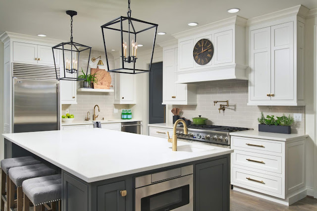
Winner: Mary Norris, Mary Norris Interiors, Tennessee
The design concept for this family kitchen was to provide a highly efficient, clean-lined kitchen. To achieve this, symmetry was used in much of the design, as well as thoughtful implementation of carefree work surfaces and ample, functional storage.
Incorporating a palatial island would address their desire for a multi-functional surface by providing a large prep surface, serving area, and additional seating. Classic and timeless white shaker-style cabinetry and grey stained oak floors were the catalyst for closing finishes.The desired aesthetic was to be cohesive with the existing traditional home, yet provide a fresh, minimalistic, and understated elegance.
In order to deliver functional storage, both the island and the range areas were designed to store, as well as to allow easy access to everything needed during meal prep. Deep drawers for pots, pegged drawers for dishes, as well as tailored utensil storage and cutlery dividers were incorporate throughout.
1st Runner Up: Michele Youell, Natural Domain Interiors, Nevada
The purist simplicity of this light and airy kitchen, showcasing the best in casual desert living, creates an oasis of peace and ease in which the client can shed the hectic demands of every day life.
The clients are two busy doctors who love to entertain with an appreciation for open, minimalistic, modern aesthetics and tranquil clean lines. Increasing the size of their kitchen from 175 to 531 square feet gave them space for every luxury amenity they wished for. The kitchen now features a spacious open concept floor plan with an abundance of natural light, high-end appliances and access to outdoor living spaces integrating with the architecture unobtrusively. A dramatic new 12 foot folding window with a 14 foot quartz counter adjoins a covered outdoor patio and pool area, visually and functionally extending the space.
1st Runner Up: Les Bernabi (TIE), Ciao Design, Montana
The designer planned a modern interpretation for log home living based on the client's needs and wishes by blending a bit of contemporary, industrial and organic elements to achieve a new look that would balance with the scale of large log structures that can easily overwhelm any design endeavor. The home was also getting a change of use from a 30 plus years old vacation home to the client's permanent year round home which also influenced our approach of colors, fabrics and materials.
Every detail of this remodel was meticulously considered. The richly contrasting elements of the warm wood in a matte gray finish, the subtle glow of the brushed metal hexagon mosaic backsplash, the pearlized white lacquer cabinets, smoky glass and quartz counters with subtle gray veining result is a composition that immerses the entire space in a comfortable, clean and timeless atmosphere.
Custom-tailored spatial planning created interior cabinet organization to ensure maximum functionality. The minimalist outer aesthetics conceal sophisticated ideas, pull-outs, and disappearing cabinets doors which can make electrical appliances “invisible” when not in use so that nothing disturbs the sophisticated atmosphere.
To fit all the new appliances and increase the kitchen footprint, we relocated the kitchen from its original location to the opposite end of the space which was the former family room. This became a fairly significant remodel involving an architect, engineer and general contractor. The biggest hurdles were rerouting the plumbing through the post-tension concrete slab. An engineer was needed to specify new support beams so that the room dividing wall could be removed and to support the 12 foot folding window on the sink wall.
1st Runner Up: Les Bernabi (TIE), Ciao Design, Montana
The designer planned a modern interpretation for log home living based on the client's needs and wishes by blending a bit of contemporary, industrial and organic elements to achieve a new look that would balance with the scale of large log structures that can easily overwhelm any design endeavor. The home was also getting a change of use from a 30 plus years old vacation home to the client's permanent year round home which also influenced our approach of colors, fabrics and materials.
The designers created a palate of colors to work with existing rock and wood surfaces but most importantly bring life to our long and gray winters but yet integrate with the outdoors for summer living. Since working with one single space for both kitchen and living area it was important to increase the footprint of the kitchen in balance with the living area of the space and offer a new platform for cooking, entertaining and a comfortable but casual lifestyle.
One of the biggest challenges was lighting the new expanded kitchen area. It is very difficult to add lighting to a log structure after initial construction. The designer didn't want to add false walls or a ceiling to detract from the open feel of the space. They solved the problem by adding three parallel strands of ss cable lighting across the entire space.
With this type of lighting you're able to add and move fixtures anywhere along the cables and it makes for wonderful friendly and task specific lighting. It is like have glowing stars overhead when it gets dark. Since our client would be using her 6 burner range a lot we needed a resilient and easy to clean surface for the back splash and range hood. This was solved by using a large format porcelain for durability and ease of maintenance and its beauty.
2nd Runner Up: Maria Causey, Maria Causey Interior Design, Northern Virginia
Dark, dreary, impractical & "too traditional" were words the clients used to describe their existing kitchen. They needed a better layout, including a walk-in pantry, better lighting, and a design that incorporated their preference for a more contemporary, clean-lined look. They wanted more seating, and wanted to transform their dark, dated morning room into a breakfast nook. They love to watch TV in the kitchen, so a custom banquette for the breakfast nook was designed to be used both for dining and relaxing. The designer took their love of neutrals and punched it up with the clients' favorite colors: orange and green.
Different, contrasting cabinetry and counters between the peripheral cabinetry & the main island keeps things from being boring, as does the custom wood & metal hood, which creates a great focal point. A knee wall between the main kitchen and the morning room was removed to open up the space. The morning room has all angled walls, none of which have the exact same size or angle. Floor-to-ceiling drapery panels conceal this and make the room cohesive. They also emphasize the height and ceiling of the room. The custom banquette had to be freestanding to accommodate the floor-to-ceiling windows. A custom rug was created to follow the contours and angles of the room.
The mud room was reconfigured to create space for the kitchen pantry while maintaining the overall size of the mud room. The result is a light, bright, spacious kitchen with plenty of storage and lots of beautiful seating. There was no walk-in pantry. A new floor plan that reconfigured, and took space from, the mud room was used to create a large walk-in pantry without sacrificing space in the mud room.


I really like this idea of small shiny pebbles - tiles above the sink. Something unheard of, but very unique!
ReplyDelete